
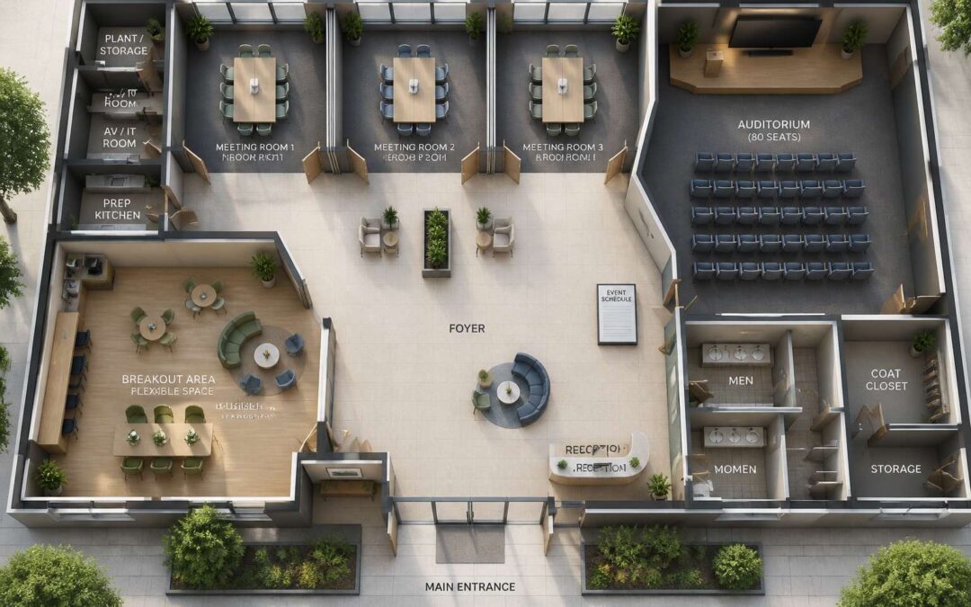
Essential Spatial Requirements for a Compact Conference Centre
Calculating Net-to-Gross Area Ratios
Roughly 35% of a small conference centre’s gross floor area vanishes into corridors, plant rooms, and wall thicknesses. For a compact venue, that shrinkage matters. The net-to-gross area ratio, or efficiency ratio, typically lands between 0.55 and 0.65. Drop below 0.55 and you’re paying rent for space attendees cannot use!
When refining the floor plan layout of small conference centre, prioritise the non-negotiables:
- Breakout rooms sized for 10 to 15 people each
- Reception zone with visible sightlines to the main hall
- Service corridor wide enough for trolleys
In my experience with Johannesburg venues, every square metre assigned to back-of-house functions directly reduces your net lettable area. Savvy designers squeeze storage vertically and share pre-function space between sessions.
Minimum Aisle Widths and Circulation Zones
Nothing exposes a crowd’s manners like a 1.1 metre gap between a registration desk and a pillar. In a floor plan layout of small conference centre, circulation zones decide whether delegates glide or graze. Main aisles need 1.8 metres of clear width, letting two people and one trolley pass with dignity. Secondary aisles can shrink to 1.2 metres, but only for dead ends. Doorways require 900 millimetres clear, and wheelchair turning spaces demand 1.5 metres across. Essential widths for a compact venue:
- Main aisle: 1.8 metres
- Service corridor: 2.0 metres for trolleys
- Breakout entry: 1.2 metres to prevent queue collisions
Straight corridors outperform curved ones, which waste space and hide bottlenecks. When the floor plan layout of small conference centre ignores these numbers, expect apologetic shoulder checks all day.
Ceiling Height and Acoustic Considerations
Ceiling height controls more than air volume. At 2.7 metres, a compact boardroom feels confined; at 3.0 metres, the same floor plan layout of small conference centre gains a sense of openness without wasting floor space. Acoustics follow the vertical dimension. Screed floors and exposed concrete reflect sound, producing a slap echo that distorts presentations. Install sawtooth absorption panels from pine or recycled acoustic board to tame reflections. Reverberation times of 0.6 seconds suit breakout discussions, while 0.8 seconds handle plenary speech.
- Minimum ceiling height: 2.7 metres
- Preferred height: 3.0 metres
- Reverberation target: 0.6 to 0.8 seconds
- Partition STC rating: 45
South African light steel frames with gypsum linings deliver strong isolation without eating into a tight footprint. Always audit the HVAC plant room, since a vibrating air conditioner can undermine every acoustic decision made in the design. That hum is your enemy!
Accessibility Standards and Universal Design
One in five South Africans lives with a disability, and most compact venues turn them away at the door. In the floor plan layout of small conference centre, accessibility is a matter of millimetres: a 900 millimetre door, a 1.5 metre turning circle, a 1:20 gradient. Universal design is not a checklist. It is a promise that every voice in the room can reach the podium.
- Clear floor space of 1.5 by 1.5 metres at every entrance
- Knee clearance under counters and tables
- Visual and audible alarms in all rooms
When these details are absent, the conference centre excludes people without making a sound. A wheelchair user becomes a spectator in a gathering meant for speakers.
Zoning and Functional Adjacencies in Small Venues
Public vs. Private Zones
In South Africa, small venues host most corporate events, yet many floor plans ignore the boundary that matters most. The line between public and private shapes the experience. A floor plan layout of small conference centre must separate the delegate journey from the work of running the building. Guests should reach the main hall without crossing service corridors. Staff should move from the prep kitchen to the function area unseen.
Public zones hold the foyer, registration, and restrooms. Private zones hold the kitchen, storage, and the control room. Their adjacency must be deliberate:
- Place the service core along one edge to free the public side for circulation.
- Set registration near the entrance but angled so queues do not block the path.
- Connect the kitchen to the function space through a discreet service pass.
Compression is the skill. Every metre works twice in a small footprint, and this careful zoning gives the smallest venue a composed, professional rhythm. A thoughtful floor plan layout of small conference centre reads as effortless.
Linking Pre-Function and Breakout Spaces
Pre-function space is the decompression zone between arrival and focused work. In small venues, it must do double duty as circulation and breakout access. The floor plan layout of small conference centre should place breakout rooms directly off the pre-function corridor, never forcing delegates to backtrack through the main hall.
The physical relationship between these rooms sets the event’s tempo. When breakout doors line a shared pre-function area, people move short distances and session changes stay orderly. Deep corridors waste square metres that could host a coffee station or a quiet seating nook.
- Breakout rooms open toward the pre-function zone, not the service side
- Coffee points sit between the main hall and the breakout cluster
- The registration desk tucks into the entry corner, away from traffic
Every adjacency in this chain consumes floor area.
Placing Service Cores and Storage
Service cores hold the operational systems of a small venue. In a floor plan layout of small conference centre, the service core contains the kitchen, the loading bay, the janitorial room, and the electrical closet. These spaces need direct access to the outside and the main hall, never across the public path.
Place the service core behind the main hall, with a single controlled door for deliveries. In my experience, storage follows a similar logic. A small venue needs storage for extra chairs and flipcharts. That storage slides between the main hall and the service core, so staff restock without crossing the pre-function zone.
- The service core sits on the outer wall.
- Storage stays near the loading door.
- A 1.2 metre staff corridor links the service core to the hall.
The public never sees the workflow, and the floor plan layout of small conference centre stays clear.
Creating Flexible Multi-Use Rooms
In a floor plan layout of small conference centre, zoning is less about dividing space and more about choreographing possibilities. A room intended for breakouts, dining, or plenary sessions earns its flexibility through adjacency, not just furniture. The key is to place flexible rooms along a shared edge, allowing partitions to slide away or close off without disturbing the service core or public paths. In South African venues, where load shedding often requires generator access, this edge also works as a technical corridor. Consider these adjacencies when plotting zones:
– Flexible rooms adjacent to a secondary lobby for independent entry
– A sound-locked vestibule between a noisy catering area and a quiet seminar room
– Shared vestibules that allow two rooms to become one
These relationships reduce the need for separate circulation and make the floor plan layout of small conference centre inherently adaptable. The true measure of a small venue is how gracefully its zones can trade identities.
Wayfinding and Visual Connectivity
People navigate small venues by instinct before they read a single sign. A floor plan layout of small conference centre should make the next room visible from the current one, or suggest its presence through daylight or a shift in floor texture. In South African venues, where summer thunderstorms can darken corridors, this visual connectivity matters twice over. Place the registration desk at the intersection of main paths, and let the tea station draw people forward. Avoid dead-end corridors that force backtracking. Open sight lines do more work than arrows ever will! When zoning a small venue, consider these wayfinding aids:
- A central atrium or double-volume space that orients visitors
- Glazed partition edges that reveal activity without the noise
- Consistent lighting tones that guide people toward public areas
The floor plan layout of small conference centre succeeds when a first-time visitor moves through it with quiet confidence.
Optimizing Room Configurations for Maximum Capacity
Theatre vs. Classroom vs. Banquet Layouts
A single misplaced table leg can slash your viable capacity by a third. In a small venue, the configuration dictates everything. Theatre style packs the most delegates, roughly 0.9 square metres per person, but your audience will sit in rigid rows for hours.
Classroom layouts push that figure to 1.8 square metres, giving attendees a work surface yet eating into your net area. Banquet rounds are the most demanding, requiring 2.3 square metres per guest and a separate dance floor. I once watched a planner promise 120 banquet seats in a room that only fit 80.
- Theatre: maximum density, minimal comfort
- Classroom: moderate density, added functionality
- Banquet: low density, high social value
Your floor plan layout of small conference centre must match each configuration to the event’s true purpose, not just the headline number. Verify your service aisles and emergency exits against these figures, then adjust.
Configurable Partition Walls and Moveable Seating
Partition walls and moveable seating do the heavy lifting in the floor plan layout of small conference centre. One moment you host a board meeting for a dozen executives, the next you stage a product launch for fifty. The key is honest hardware. Test the hinges until they squeak, because a sticking partition will ruin your schedule.
- Folding wall depth (does it eat into the room?)
- Seat nesting ratio (chairs stacked per square metre)
- Caster lock quality (wobbly chairs annoy attendees)
I have watched venues claim a ten minute reconfiguration. Then the wheels jam on the carpet. Buy casters with proper brakes. Your delegates will reward you with their full attention.
Integrating Built-in AV and Technology
Over half of venue complaints stem from technology failures, not furniture or acoustics. That statistic shapes my approach to the floor plan layout of small conference centre. The AV system gets drawn onto the blueprint first. Positioning screens where every delegate can see and microphones where the presenter stands takes priority.
The floor plan layout of small conference centre must reconcile theoretical capacity with workable capacity. A room holding sixty classroom style might only fit thirty five once laptops are open. Table pitch, power outlet spacing, and the AV control rack shape that real number, and in South Africa, so does the backup power system. I run a simple checklist:
- Power outlets reachable from every seat
- Cable access at table level
- Screen size matched to room depth
- AV control accessible to technicians
I appreciate venues that treat capacity as a dynamic number, tested often.
Balancing Natural Light with Blackout Options
At 9am in Johannesburg, east facing glass turns a projector screen into a pale rectangle. The floor plan layout of small conference centre often ignores this moment. Window placement dictates where the screen can live. If you put the screen on a wall perpendicular to the brightest windows, you keep daylight without losing contrast. Blackout blinds remain a backup, not the default.
Room configuration changes how much light matters. Theatre style with a central aisle pushes rear seats into darker zones. Classroom tables near the window give note takers enough light without glare on laptops. I have seen venues claim sixty seats, but half of them sit in direct sun. Test the room at 10am and again at 3pm. That real number becomes your true capacity.
Emergency Egress and Fire Safety Routes
Capacity means nothing if the room cannot empty itself. The floor plan layout of small conference centre must treat every seat as a body moving toward a door. Fire safety routes require strict geometry. In Johannesburg, municipal approval hinges on exit widths and travel distances. I calculate occupancy first, then arrange furniture around the escape paths. A theatre row ending six metres from an exit feels generous. It is not. Measure the actual swing of each door. Check that no table leg intrudes into the marked route.
Consider the hidden failures:
– A stacked chair trolley blocking a fire escape
– A partition wall that turns a two-exit room into a single-exit trap
– A stage riser that narrows the path to exactly the legal minimum
The egress route must remain visible even when the lights fail. That is the true test of any configuration.
Traffic Flow and Crowd Management Strategies
Managing Arrival and Registration Bottlenecks
In the first ten minutes of any conference, the registration desk becomes the single point of congestion. A study shows that 70% of attendees arrive in the same half hour. Your floor plan layout of small conference centre must absorb this surge without creating a stampede.
Separate the queue from the footpath. Never let the line block the main aisle. Position the desk perpendicular to the entrance and use stanchions to create a winding channel.
For a small centre, try these:
- Pre-print badges and sort them alphabetically into bins
- Set up a quick collection counter for online check-ins
- Place a digital signage screen showing live wait times
Once past registration, give delegates a clear sightline to the first breakout room. This pulls them forward, preventing clusters. This element of your floor plan layout of small conference centre keeps the surge from becoming a jam.
Designing Efficient Breakout Transitions
The first session ends and the room exhales. A wall of delegates moves toward the doors, and the floor plan layout of small conference centre suddenly faces its true test. The opening rush is chaotic, but the transitions between breakouts are where the day can quietly unravel. A queue at the coffee station or a slow room release creates a ripple effect that pushes back into the corridor. Every minute lost here steals time from the next speaker.
The key is to design for the movement of a crowd that is always in flux. The floor plan layout of small conference centre should create a natural decompression zone outside every breakout room. This is not a wide hallway. It is a deliberate pocket of space where people can pause, orient themselves, and decide their next move without blocking the path. When you place doors opposite each other, you invite head on collisions. Offset them instead.
Room release timing matters just as much as square footage. A crowded room empties slowly when people need to gather their things. The floor plan layout of small conference centre can support this by placing a visible screen outside each door showing the next session time. This pulls people forward and gives them a reason to keep moving.
Consider the flow between two popular sessions. One ends at 10:00, the other at 10:15. The overlap turns the passage into a bottleneck in reverse. A strong floor plan layout of small conference centre staggers the session lengths so that one group has fully cleared before the next approaches. The space between rooms becomes a holding pattern rather than a scramble.
There is a quiet detail that often gets overlooked. The angle of the door swing. A door that opens outward into a corridor eats up the walking path. A door that opens inward keeps the passage clear. This simple choice in the floor plan layout of small conference centre changes the entire rhythm of the day. When two doors open at once, the right angle prevents a sudden wall of bodies.
You also want to avoid placing the tea station directly outside a breakout exit. The crowd that leaves the room will cluster around the counter, blocking the flow for anyone trying to reach the next session. A better approach is to tuck the refreshment point around a corner, just out of sight from the door. People will still find it, but the surge will break before it forms a jam.
The movement between sessions is a story of anticipation. People check their phones, scan the signage, and glance at the doorways. The floor plan layout of small conference centre should make that anticipation effortless. Keep the next room visible from the previous exit. If the path turns, place a clear sign at the exact turning point. Do not force anyone to stop and think.
Another effective strategy is to widen the corridor at the midpoint between rooms. This gives the flow a natural rhythm, a place where people can slow down without feeling pressured. The grid of the floor plan layout of small conference centre can feel tight in the morning, but the midday transitions are where hidden bottlenecks appear. You want to catch those before they happen.
When you work with a small venue, every metre counts. The floor plan layout of small conference centre should use the space between rooms for storage, not just circulation. This frees up the main paths for people. A neat room divider or a retractable screen can create a flexible holding area that shifts with the day’s schedule.
– Overlap the session times to stagger the crowd flow
– Place directional signage at eye level, directly at the decision points
– Angle the doors so they open inward and avoid blocking the pass
– Position the furniture so the exit path stays clear of chair backs
– Use a visual countdown timer near the door to encourage timely wrap ups
The transition itself is a form of communication. You can tell the story of the afternoon by how smoothly the crowd moves. A cramped turn, a sudden stop, a hesitant pause, these are the details that shape the experience. The floor plan layout of small conference centre that works well is the one where the audience never notices the planning that went into it.
One observation from my own work in this field: the best layouts are the ones that give people a sense of space even when the area is small. The floor plan layout of small conference centre should open up the visual pathways, letting the eye travel past the immediate crowd. When a delegate can see the next room, the distance feels shorter and the walk feels less crowded.
You also need to consider the acoustic handshake between rooms. When two breakout sessions run at the same time, the sound bleed can drive people into the corridor to escape the noise. This adds unintended bodies to the walkway. A well planned floor plan layout of small conference centre uses the buffer zones between rooms to absorb this overflow, whether it is a utility closet, a storage niche, or a narrow passage.
The final piece is the human factor. People respond to cues from others. If the first person out of a room turns left confidently, the rest follow. If that person stops to read a map, the flow hesitates. The floor plan layout of small conference centre can preempt this by placing visual anchors, a plant, a poster, a bright wall panel, that guide the eye in the intended direction. Small signals, big effect.
Locating Restrooms and Refreshment Stations
Restrooms are the great equalizer of any conference. Place them poorly, and the floor plan layout of small conference centre turns into a social choreography of awkward glances. Position them away from the main circulation spine, yet close enough that a quick visit does not require a trek. A corridor that forces delegates to walk past a refreshment station to reach the restroom creates a natural pause point.
Refreshment stations demand the same strategy. A single central counter invites a swarm. Split the coffee into two smaller islands, each with its own queue. This spreads the crowd and keeps the space fluid. Place one near the registration zone, the other deeper into the breakout wing.
- Never align a restroom door directly with a breakout exit.
- Keep the path to the counter at least two metres wide.
- Position bins at the exit of the queue, not the entrance.
- Add an internal vestibule to the restroom to absorb the shuffle.
Staff-Only Corridors and Service Logistics
I have watched delegates execute a perfect human pileup at a single narrow door. A well-planned floor plan layout of small conference centre anticipates this surge. Design circulation loops that split the crowd before they bottleneck. Vary corridor widths, and place visual cues at decision points to keep the flow steady.
Staff corridors operate behind the scenes. Caterers, cleaners, and technicians need paths that avoid delegate zones completely. This separation ensures a server with stacked coffee cups never collides with an attendee checking their phone.
- Locate service access near kitchen and storage zones
- Include noise-reducing doors on staff corridors
- Mark service routes with clear signage
When the inner workings stay invisible, the venue appears effortless. The floor plan layout of small conference centre succeeds when nobody notices it working.
Practical Design Pitfalls to Avoid in Small Conference Centres
Overloading Fixed Furniture
Overloading a small conference centre with permanent furniture reduces the flexibility your floor plan layout of small conference centre needs. I have walked into venues where a large joinery unit dominates the pre-function zone. Fixed seating, immovable podiums and built-in counters seem efficient at first, but they restrict you to one operational mode. Every square metre lost to these fixtures cannot host a pop-up registration desk or an impromptu networking corner.
Consider the traps:
- Built-in banquettes that cannot be reconfigured for different event sizes
- Permanent beverage stations that block circulation paths
- Fixed lecterns that dictate the orientation of every session
Each choice narrows the range of bookings you can accept. The true cost appears when a client requests a cabaret setup or a cocktail format, and your floor plan layout of small conference centre simply cannot adapt.
Ignoring Acoustic Privacy Between Rooms
Some designers treat walls as visual boundaries, not acoustic ones. In a floor plan layout of small conference centre, sound bleeds through partition junctions and door gaps, turning a confidential boardroom session into public knowledge. I have sat in a venue where the hum of a breakout room next door made every speaker raise their voice. The result: neither room works.
- Sharing a ventilation duct between meeting rooms, which carries voices directly.
- Specifying lightweight sliding doors that lack a sound transmission class rating.
- Placing breakout walls against a common corridor without buffer zones, so every footstep interrupts.
Acoustic privacy means a speaker can disagree, negotiate or disclose without fear. When you ignore this, the floor plan layout of small conference centre becomes a liability, not a space. That is the real betrayal.
Underestimating Catering and Kitchen Requirements
Ask any organiser to name the moment a conference begins to unravel, and they will point to the tea break. The clatter of a trolley, the queue snaking past a fire door, the lukewarm coffee. Catering is treated as an afterthought in many floor plan layout of small conference centre documents.
A kitchen deserves more than a corner of the service core. It needs a proper sequence of zones:
- A receiving area for fresh stock, away from guest traffic.
- A prep and plating section with adequate counter space.
- A dishwash station that does not block the exit or the service pass.
Keep those zones connected, then add a pass door that opens directly into the pre-function area. The floor plan layout of small conference centre should also respect the daily rhythm of a South African venue. The 10.15 coffee rush, the 14.00 sandwich run, the stacked plates returning mid-session. Without a covered holding area and a dedicated fridge zone, the kitchen becomes a bottleneck. And a bottleneck near a seminar room means every presenter competes with a kettle.
Neglecting Outdoor or Overflow Areas
Most small conference centres treat the outdoor courtyard as an afterthought, a place for smokers to hover. That is a missed opportunity. In South Africa, the weather often allows for al fresco sessions. A deck or covered patio can absorb overflow from a packed keynote or host a breakaway group without disturbing the main programme.
Yet many floor plan layout of small conference centre designs fail to include a direct walkway from the seminar rooms to the outside. Signs of this neglect are easy to spot:
- No shaded seating near the breakout exits.
- No weatherproof power outlets for AV carts.
- No direct view from the tea station to the patio.
Add a covered verandah and a simple water point. Also consider the car park drop-off zone as temporary overflow. The plan should show how doors open outward and how the gradient handles wheelchairs. Neglecting these areas forces delegates into corridors, and that creates bottlenecks.
Skipping Detailed Furniture Layout Testing
Some floor plan layout of small conference centre documents show chairs and tables placed with mathematical precision. Yet the first time the venue manager tries to set up a classroom style room, the reality collapses. A table jams against a power outlet. The wheelchair space forces the rear row into the aisle. Skipping furniture layout testing means you discover these failures on move-in day, not during design.
Test your actual furniture, not the dimensions on paper. A 1,800 mm table might fit the drawing, but turning it into a U shape requires extra clearance. The moveable wall pocket takes up 600 mm you forgot to subtract.
- Stack chairs to check the storage room access.
- Set up a full row to verify knee clearance.
- Walk the route from storage to the seminar room.
This testing converts the floor plan layout of small conference centre design from an abstraction into something that works by 08h00 on a Monday morning.